Issue 2550777
Created on 2012-09-13 11:23 by sqz, last changed 2016-04-09 03:45 by rouilj.
| Files | ||||
|---|---|---|---|---|
| File name | Uploaded | Description | Edit | Remove |
| issue.item.html | sqz, 2012-09-13 11:23 | example to integrate 'edit'-button (roundup 1.4) | ||
| rounduptracker-improved.png | sqz, 2012-09-13 11:30 | |||
| Messages | |||
|---|---|---|---|
| msg4644 | Author: [hidden] (sqz) | Date: 2012-09-13 11:23 | |
Im not going to propose a mobile/ajax-htmltheme (as others proposed),
but some small tweaks which make the lookandfeel a bit more like
'nowadays' imho.
These are small fixes which improve tablet/smartphone viewing a bit, and
give everything a bit more 'zen' to it.

html/style.css
==============

 body.body {
  font-family: sans-serif, Arial, Helvetica;
  background: url('logo.big.jpg') no-repeat 44px 20px;
  color: #333;
+  margin: 2.0em;
 }

+pre{
+ white-space: pre-wrap;       /* css-3 */
+ white-space: -moz-pre-wrap;  /* Mozilla, since 1999 */
+ white-space: -pre-wrap;      /* Opera 4-6 */
+ white-space: -o-pre-wrap;    /* Opera 7 */
+ word-wrap: break-word;       /* Internet Explorer 5.5+ */
+ padding:1.0em;
+}

+button.button-big{
+  width:140px;
+  height:70px;
+  font-size:20px;
+}


 table.body {
   border: 0;
   padding: 0;
+  border-spacing: 1.0em;
   border-collapse: separate;
 }


html/issue.item.html
====================
<textarea tal:content="request/form/@note/value | default"
            name="@note" wrap="soft" rows="5" cols="80"></textarea>

(I changed the wrap="hard" to wrap="soft", and in combination with the
<pre> stylesheet-settings, it wont break long urls, because then they
become unclickable, and also it will prevent the 'search'-field
dissappearing from the screen which happened with long content)

The edit button
===============
Attached is my issue.item.html which initally hides the form-fields
behind a big Edit-button. I had to do this because else issues looked
too complex for my nontech-clients. After using it for almost a year, I
can say Im really used to it, and I think the experience is much more
calmer now. Think about it: first information, then editing-forms :)
|
|||
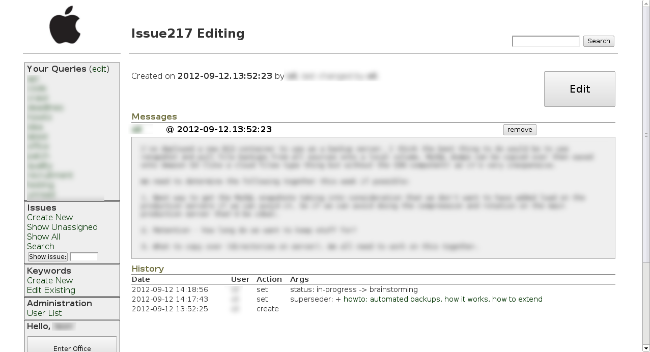
| msg4645 | Author: [hidden] (sqz) | Date: 2012-09-13 11:29 | |
here is a screenshot |
|||
| msg4646 | Author: [hidden] (sqz) | Date: 2012-09-13 11:30 | |
here is a screenshot |
|||
| msg4647 | Author: [hidden] (sqz) | Date: 2012-09-13 11:35 | |
correction: the breaking of long-urls problem still exists, must be an issue of the url-highlighter-routine in roundup's core. |
|||
| msg4648 | Author: [hidden] (sqz) | Date: 2012-09-13 11:46 | |
oh..and last but not least, this adds some 'progressive enhancement' to
the sidebars (as in: looks fancier in new browser, but wont break old
browsers)


style.css
=========
 td.sidebar p.classblock {
+  padding: 15px 5px 5px 15px;
   margin: 4px 0px 4px 0px;
+  border: 1px solid #AAA;
+  background-color: #F0F0F0;
+  border-radius: 5px; /* CSS5 compliant browsers */
+  -moz-border-radius: 5px; /* firefox */
+  -webkit-border-radius: 5px; /* Google Chrome, Safari  */
+  -khtml-border-radius: 5px; /* Linux Browsers */
 }

 td.sidebar p.userblock {
+  padding: 15px 5px 5px 15px;
   margin: 1px 1px 1px 1px;
+  border: 1px solid #AAA;
+  background-color: #F0F0F0;
+  border-radius: 5px; /* CSS5 compliant browsers */
+  -moz-border-radius: 5px; /* firefox */
+  -webkit-border-radius: 5px; /* Google Chrome, Safari  */
+  -khtml-border-radius: 5px; /* Linux Browsers */
 }


I think it would be better to do slight changes to the current
stylesheet, instead of building a new layout from scratch (thats very
risky concerning all the testing done so far for the current layout)
|
|||
| msg4649 | Author: [hidden] (rouilj) | Date: 2012-09-13 13:24 | |
In message <1347535435.45.0.649588360548.issue2550777@psf.upfronthosting.co.za> <1347535435.45.0.649588360548.issue2550777@psf.upfronthosting.co.za>, Coder of Salvation writes: >html/issue.item.html >==================== ><textarea tal:content="request/form/@note/value | default" > name="@note" wrap="soft" rows="5" cols="80"></textarea> > >(I changed the wrap="hard" to wrap="soft", and in combination with the ><pre> stylesheet-settings, it wont break long urls, because then they >become unclickable, and also it will prevent the 'search'-field >dissappearing from the screen which happened with long content) Hmm, I never saw the search box dissapear. I have had to scroll to get to it on occasion though. What browser were you using that removed the search box based on line wrap for the note field? >The edit button >=============== >Attached is my issue.item.html which initally hides the form-fields >behind a big Edit-button. I had to do this because else issues looked >too complex for my nontech-clients. After using it for almost a year, I >can say Im really used to it, and I think the experience is much more >calmer now. Think about it: first information, then editing-forms :) If this is to be included we need to make it an option settable from tracker.ini. RT and some other ticketing systems use this same view and oinly then edit model. That means you can't start editing as soon as the ticket is pulled up. You have to wait for a another round trip to the server to render the ticket in a form that is useful. It really is a pain and slows down ticket management IMO. The number of fields that an average user can change (and therefore are in edit mode) is usually much less than that of the person responding to/managing the ticket. I have never had an issue with users being confused by the edit fields. But I can see it being a valid use case, I just think it makes for a poor work flow so should be optional and controllable on a per tracker basis by an option (rather than having to cut the code out of the template). |
|||
| msg4650 | Author: [hidden] (ezio.melotti) | Date: 2012-09-15 03:45 | |
> +pre{
> + white-space: pre-wrap;       /* css-3 */
> + white-space: -moz-pre-wrap;  /* Mozilla, since 1999 */
> + white-space: -pre-wrap;      /* Opera 4-6 */
> + white-space: -o-pre-wrap;    /* Opera 7 */
> + word-wrap: break-word;       /* Internet Explorer 5.5+ */
> + padding:1.0em;
> +}

We also have something similar here:
http://hg.python.org/tracker/python-dev/diff/7661716411a5/html/style.css


> html/issue.item.html
> ====================
> <textarea tal:content="request/form/@note/value | default"
>             name="@note" wrap="soft" rows="5" cols="80"></textarea>
>
> (I changed the wrap="hard" to wrap="soft", and in combination with the
> <pre> stylesheet-settings, it wont break long urls, because then they
> become unclickable, and also it will prevent the 'search'-field
> dissappearing from the screen which happened with long content)

We removed it altogether from our instance because it's not valid HTML
(http://www.w3.org/TR/html401/interact/forms.html#edef-TEXTAREA) and it
was causing problems with Konqueror
(https://bugs.kde.org/show_bug.cgi?id=220005).


> Think about it: first information, then editing-forms :)

We experimented with something similar but it didn't work too well.
This is a solution we tried:
http://hg.python.org/tracker/python-dev/rev/fa0c45837434
This was something similar but applied to the history at the bottom:
http://hg.python.org/tracker/python-dev/rev/525d3e387a65
Both got reverted, mainly because people didn't want to go through an
extra click before being able to reply to the issue and/or to read
information (it should be mentioned that this feedback came from
developers, hiding the form is probably OK for casual users).  Our
solution didn't completely hide the form, just turned it in a shorter
read-only summary of the most important fields.

We also try to keep the UI as clean as possible, avoiding extra clutter
and unnecessary information (or at least that's the general idea) -- you
might find some of ours solutions browsing the hg history.

Your big "edit" button seems nice though, so maybe we will experiment
again in the future.  (FWIW bigger buttons are a usability win, so I
made the "submit changes" button bigger:
http://hg.python.org/tracker/python-dev/rev/7540b96110c9)

FTR you can find this on http://bugs.python.org/


> But I can see it being a valid use case, I just think it makes for a
> poor work flow so should be optional and controllable on a per tracker
> basis by an option (rather than having to cut the code out of the
> template).

Not sure that's a good idea.  I think providing a default template and
let users customize it as they want it's already OK, otherwise you might
end up with several (possibly conflicting) options for different tweaks.
 OTOH it would be nice to collect somewhere snippets that can be added
to the default template to obtain different results.
|
|||
| msg4651 | Author: [hidden] (sqz) | Date: 2012-09-16 10:48 | |
Thank you for the answers. Yes of course everybody has their own preferences. As far as Im concerned, lets leave it at this, the tweaks can be found in this issue. The templates are easy editable, so everybody can tweak it to his/her likings. I also agree we shouldnt include too much frontend-assumptions, configurable or not. Rounduptracker is an highly configurable opensource softwaresolution which can satisfy everybody after some tweaking. |
|||
| msg5504 | Author: [hidden] (rouilj) | Date: 2016-04-09 03:45 | |
Closing but leaving this ticket available for people that want to try tweaking the existing style. |
|||
| History | |||
|---|---|---|---|
| Date | User | Action | Args |
| 2016-04-09 03:45:45 | rouilj | set | status: new -> closed messages: + msg5504 title: small/easy lookandfeel improvements -> small/easy look and feel improvements |
| 2012-09-16 10:48:42 | sqz | set | messages: + msg4651 |
| 2012-09-15 03:45:20 | ezio.melotti | set | nosy:
+ ezio.melotti messages: + msg4650 |
| 2012-09-13 13:24:37 | rouilj | set | nosy:
+ rouilj messages: + msg4649 |
| 2012-09-13 11:46:08 | sqz | set | messages: + msg4648 |
| 2012-09-13 11:36:00 | sqz | set | messages: + msg4647 |
| 2012-09-13 11:30:50 | sqz | set | files:
+ rounduptracker-improved.png messages: + msg4646 |
| 2012-09-13 11:30:05 | sqz | set | files: - rounduptracker-improved.png |
| 2012-09-13 11:29:38 | sqz | set | files:
+ rounduptracker-improved.png messages: + msg4645 |
| 2012-09-13 11:23:55 | sqz | create | |